L’Chaim Vodka Creative
POSITIONING::
—————————–
[logo/tagline + identity system; brand message/essence + strategy; ad campaigns; digital; schwag; events + sponsorships]
CONCEPT #1
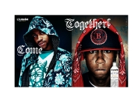
“To Life” + “Come Together”
—————————–
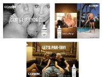
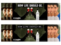
This concept expresses not only the positive/up side of life (“to life”/”cheers”) but also can and will touch on some very serious social issues and tensions. L’Chaim is about bringing the world together in celebration of life. This campaign will bring two “opposites”, “competitors”, “social and political foes’, “public enemy’s” etc. together with memorable graphical images and marketing messages, for example: “How Life Should Be”, L’Chaim, “Come Together”, “To Life”. It also sends a strong message to the world that L’Chaim vodka is a fun brand focusing on the lighter side of life by addressing the heavier side with wit and humor and breaks down the walls of separatism, elitism, stereotypes, hatred and war and evokes images of hope, peace, joy and celebration.
This can also be looked at as the Kaleidoscope of Life…instead of one image coming together, put pieces of multiple pictures together that you normally would not see or readily associate with until it all comes clear and in focus. L’Chaim is the catalyst or “peace offering” that brings those multiple displaced images into perfect focus and harmony. “How Life SHOULD Be” or as the Beetles said it so perfectly…”Come Together!”
CONCEPT #2
“The New World Spirit”
—————————–
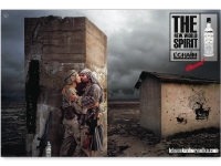
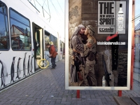
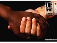
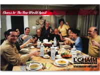
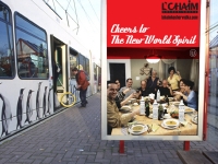
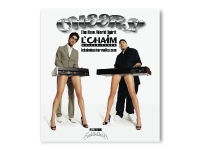
The New World Spirit- Enemies Unite-
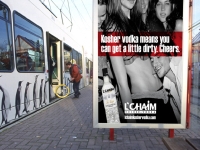
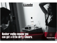
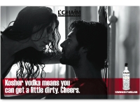
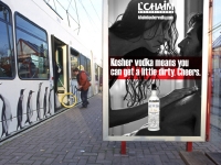
This is a very bold in your face approach to creating/suggesting CHANGE-for the good. It’s revolutionary thinking-provocative, controversial and loaded with shock value. It may even be borderline offensive-but it’s a risk assessment equation. It will cut through cultural, social, political and religious guidelines, standards and traditions and challenge the way people look at and view the world today. It is “A Brave New World” meets the duality of the word “Spirit.” First and foremost, L’Chaim is a “Spirit” meaning an alcoholic beverage or liquor. But secondly and more defining is that L’Chaim is a new way of thinking for the modern man and woman and may even be referred to as a social/political movement or reformation. The buzz and talk value generated by a campaign like this would be intense, fierce and immeasurable . The impact could not be equated to any paid advertising or media opportunity.
We could turn the volume up or down on this campaign just by swapping out images. We could tone it down for the public launch and turn it up for the viral launch (YouTube, Veoh and other video aggregators). Extensions of this idea include::
American soldier and Arab soldier (male/male; male/female; female/female)
Jewish solider and Arab solider
Wall Street Executive. and a Blue Collar, Rough-Neck celebrating
A Yankees and a Red Socks player or fan joyfully toasting
Rival sports team’s fans kissing (2 men/2 women/man and man and woman)
White trash tattooed Biker dude and a Ghetto, gangbanger Black guy toasting to life
Obama and Chavez or Castro
Skinhead and a Jewish guy
A ‘Blood’ and A ‘Crip’
Etc——
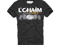
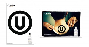
The “U” symbol is also a key element in building this brand and is prominently displayed with purpose. It stands for Orthodox Union Certified. There are about 5 or 6 organizations that certify kosher products around the world. This one is the most recognized and respected. You’ll see it on many product packages. But only Absolut and 3 or 4 other vodkas carry this symbol. Although no one really knows it, almost all vodkas are kosher by design as ingredients make them kosher or non-kosher. Vodkas have no non-kosher ingredients so it is understood by the ‘in the know’ community that even without the symbol most vodkas are kosher. Still we used it as a subtle but important design element/feature and also to proudly (and tactfully) state without fear of alienating any particular market segment that L’Chaim is proud of it’s roots and just better in addition to being different and unique.
